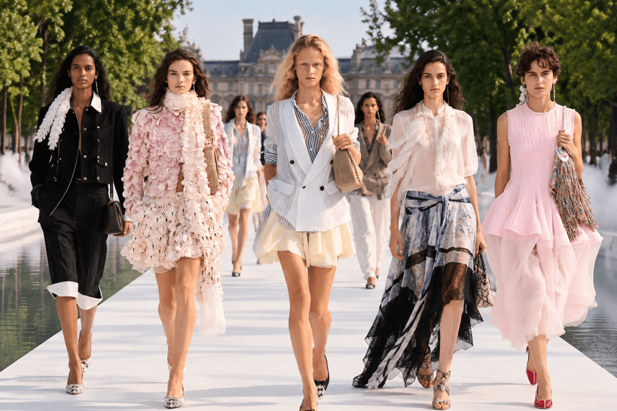
DIOR, JOIE DE VIVRE, LIGHTNESS AND FEMININITY AT PARIS FASHION WEEK SS27

Paris, September 29, 2026. In the Jardin des Tuileries, on a runway suspended over the water and veiled by a light mist, Jonathan Anderson presents Dior’s Spring Summer 2027. Trees, water and natural light accompany a collection that seems to want to free both the body and the clothes from any unnecessary weight.

Fashion becomes airy, imaginative, full of movement. Chiffon, organza, tulle, lace and sheer fabrics meet petals and appliqués that seem to move with every step. Powder pink, pale blue, white and soft yellow sit alongside stripes, Prince of Wales check and sudden metallic flashes. Skirts gain volume without becoming stiff, while menswear-inspired blazers and shirts enter the wardrobe without taking anything away from the femininity of the figure.

And this is perhaps what I like most about Jonathan Anderson‘s work. His woman feels no need to hide behind severe constructions or to masculinize herself in order to assert her presence. She is feminine, light, romantic when she wants to be, but never fragile. The clothes follow the body, accompany it, sometimes reveal it; the layering looks spontaneous, but behind that ease lies precise work on proportions, materials and volumes.

There is a lot of joie de vivre in this collection. You find it in the color, in the movement of a skirt, in a sheer panel, in a shirt left loose under a jacket, in the almost irregular lightness of the appliqués. Dior’s historic codes are also treated with greater freedom: not a copy of the past, but a different way of carrying some of its signs into the present.

Jonathan Anderson thus continues his dialogue with one of the most important legacies in French fashion, without letting himself be imprisoned by it. And this Spring Summer 2027 conveys above all one feeling: the pleasure of dressing, of being a woman and of showing it naturally.


GALLERY

click on the images to enlarge


Discover more of Sara’s World

Sara Dal Monte

Sara Dal Monte
Digital Journalist | Photographer | Art Director
Los Angeles • Sure-Com America
Instagram
X
Facebook
Facebook 2
Facebook Page

SAINT LAURENT DRESSES PARIS IN GOLD

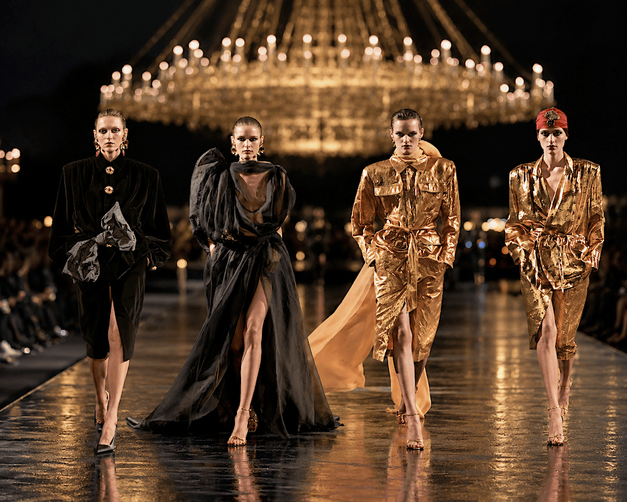
Paris, September 29, 2026. At the Fontaines du Trocadéro, with the Eiffel Tower in the background, Anthony Vaccarello celebrates his ten years at the helm of Saint Laurent, turning one of the most iconic places in the French capital into a monumental open-air set. Great golden chandeliers suspended above the runway, lights and reflections on the mirrored floor turn the Trocadéro into an expanse of gold.

A spectacular set, but not an end in itself. The great chandeliers recall the Salon Impérial of the Hôtel Inter-Continental, where Yves Saint Laurent began presenting his collections in 1976. Fifty years later, Vaccarello reclaims that memory and takes it outdoors, under the Paris sky, in dialogue with the Eiffel Tower. Gold moves from the set to the clothes: saharienne jackets and clean-lined suits, precious embroidery, sheer fabrics and a few touches of color. Then comes black, more rigorous in velvet and more sensual in the great drapes. After the glow comes the night, yet Saint Laurent remains perfectly recognizable.

And this is exactly what I keep appreciating about Vaccarello. In years when too many creative directors seem to feel the need to overturn a Maison in order to leave their mark, he has done something more difficult: being recognizable without erasing Saint Laurent. He has worked on an enormous legacy without becoming its prisoner and without tearing it down to prove he is new. The result is fashion that preserves seduction and rigor, yet clearly bears his signature.

For days there have been rumors about his possible departure from the Maison. At the moment there is no official confirmation. Let’s hope it isn’t true. At the end of the show, Vaccarello symbolically handed the keys of Saint Laurent to his son, a gesture that inevitably stays with you on an evening so charged with meaning.

Vaccarello has given a great deal to Saint Laurent and is one of the creative directors I continue to appreciate the most. This show proves it once again: respect for history, the ability to reinterpret it and, above all, a personal vision that has no need to erase what came before.


GALLERY

click on the images to enlarge


Discover more of Sara’s World

Sara Dal Monte

Sara Dal Monte
Digital Journalist | Photographer | Art Director
Los Angeles • Sure-Com America
Instagram
X
Facebook
Facebook 2
Facebook Page

ERMANNO SCERVINO SS27, FEMININITY RETURNS TO CENTER STAGE

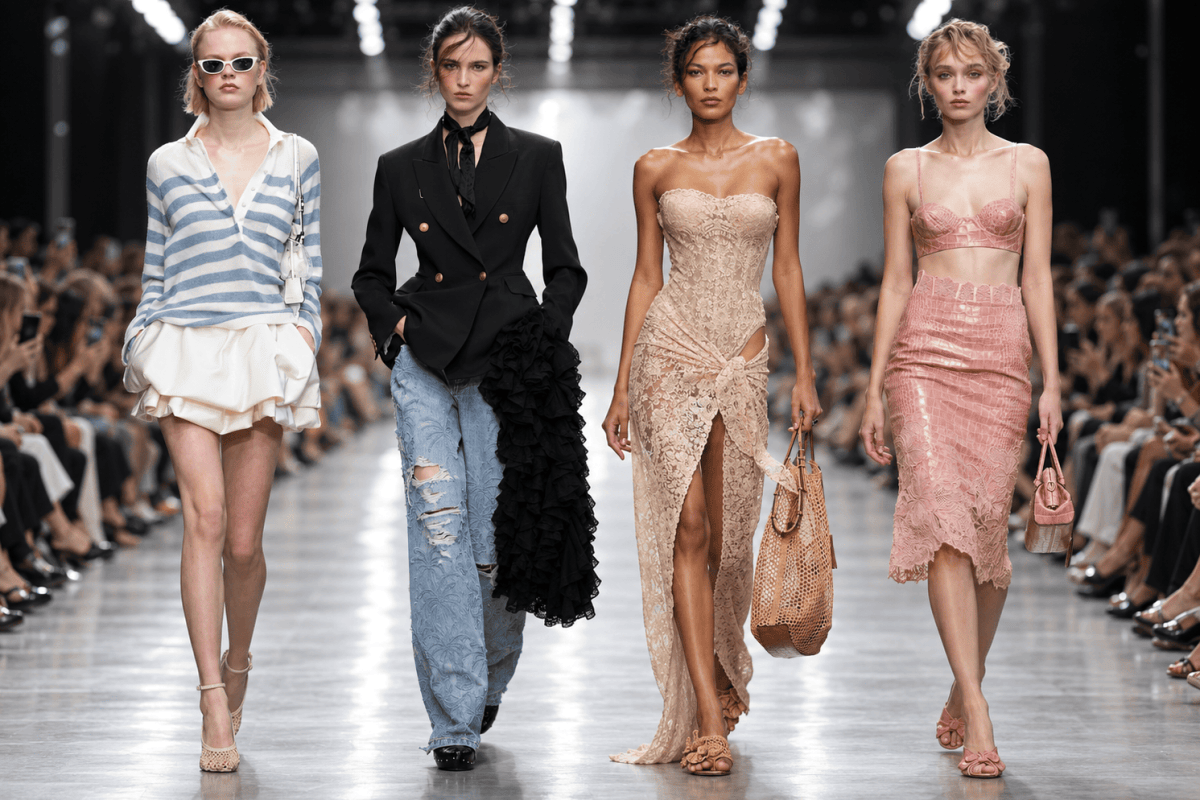
Ermanno Scervino brings to Milan Fashion Week a collection that puts back at the center something only seemingly simple: a garment should enhance the person wearing it, not replace her. This is the starting point of the Spring/Summer 2027 collection presented this morning at 10:30 at Piazza Lina Bo Bardi 1, a show built on femininity, on material and on a tailoring that feels no need to deform the body to prove it is contemporary.

Scervino works on the contrast between structure and lightness with a naturalness that holds the whole collection together. Blazers mark the waist, trousers widen, leather jackets and trench coats provide structure, while lingerie, bustiers, slip dresses, lace and sheer fabrics lighten the design and constantly bring attention back to the body. They are not separate worlds, but two registers that coexist and strengthen each other. Lingerie leaves the private sphere and becomes dress, top, construction; lace is no longer mere ornament but real material, capable of defining a silhouette as much as a well-cut jacket.

Even when the collection reveals a lot of the body, there is never a sense of shouted sensuality. The shorts are short, the bustiers evident, the transparencies declared, but everything stays within a precise control of proportions. Sensuality is not pursued through excess, but through the way the fabric falls, tightens, lets the body be glimpsed, follows movement. This is where Scervino’s work becomes most interesting, because the garment does not take over the woman: it accompanies her and heightens her presence.

Material plays a central role, but it is not exhibited as a technical exercise. Lace, embroidery, crochet, leather, denim, satin and precious workmanship enter the garments without turning the runway into a display of skill. Everything remains at the service of the silhouette. The palette too, from whites and ivories to shades of honey, tan, chocolate, black and powder pink, maintains a visual continuity that makes the collection legible and coherent. Light blues and palm-tree prints introduce a more summery note, but without slipping into the easy resort image.

The point, however, lies elsewhere. A great garment should never ask the person to disappear in order to be noticed. It should do the opposite: increase her presence, give her strength, correct, accompany, enhance. In this show Scervino does so very often, and he does it without needing to build unreal characters. The models remain women, the body remains legible, and femininity is not treated as something to be corrected or demolished.

And this is perhaps the most interesting part of the collection. In a season in which so much fashion keeps seeking the new through exasperation, Scervino chooses to work on beauty without making it banal. He does not give up research, but puts it at the service of the garment and the person. Fashion can be rupture, provocation, experimentation, but it can still have another function too: making a woman feel better in what she wears.


GALLERY


Discover more of Sara’s World

Sara Dal Monte

Sara Dal Monte
Digital Journalist | Photographer | Art Director
Los Angeles • Sure-Com America
Instagram
X
Facebook
Facebook 2
Facebook Page

TOD’S, THE CODE LIES IN THE DETAILS

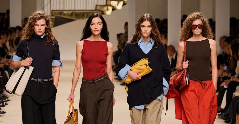
This morning Tod’s opened the day at Milan Fashion Week with Matteo Tamburini’s Spring Summer 2027 collection and, looking at it, the first thing that came to mind was very simple: some brands need to be read, others are understood by the way they are made. Tod’s belongs to the second category. Not because it necessarily has to show a logo or an element recognizable from a distance, but because over time it has built a precise way of working on materials, accessories and proportions. I personally chose these looks because they are the ones I liked most and because, together, they tell this identity well without needing too many explanations.

Tamburini continues to work on a wardrobe that appears simple but is in fact highly controlled. There are wide trousers, Bermuda shorts, trench coats, leather skirts, knitwear, clean dresses and relaxed volumes, yet nothing seems left to chance. That is exactly where Tod’s makes the difference: in the finishes, the bags, the buckles, the shoes, the leathers, in the way an accessory enters the look without seeming added afterwards. I really like this balance, because it avoids that feeling of a collection built to astonish at all costs and instead lets the quality of the project emerge.

Tod’s comes from leather goods and footwear, and that culture is still felt very strongly. The bags have presence but do not weigh down the look, the shoes always seem conceived together with the outfit rather than as an afterthought, and belts and buckles become part of the overall construction. It is a care that shows even when the look becomes softer or more everyday. In fact, perhaps that is where it shows even better, because when you remove the spectacle, the real work remains: the shape, the material, the way a pair of trousers falls, the edge of a jacket, the relationship between a shirt and a bag.

This is what interests me about Tod’s today. Not shouted luxury, but precision. Not effect, but the continuity of a language. Tamburini does not seem to want to turn the brand into something it is not; he is doing subtler work, trying to bring Tod’s craft heritage into a lighter, contemporary and easy-to-wear wardrobe. And in my view the collection works precisely when it manages to do this: keeping the brand’s character recognizable without stiffening it into formulas already seen.

Looking at these looks, the feeling is that Tod’s still has an important advantage: it has a vocabulary of its own. It does not need to explain it from scratch every time. It is enough to observe a bag, a shoe, a buckle, a leather treatment or the cut of a garment to understand that behind it there is a precise product culture. And perhaps this is what I liked most about this morning’s show: the feeling that every detail is there because it serves a purpose, not to fill the stage.


GALLERY


Discover more of Sara’s World

Sara Dal Monte

Sara Dal Monte
Digital Journalist | Photographer | Art Director
Los Angeles • Sure-Com America
Instagram
X
Facebook
Facebook 2
Facebook Page

MAX MARA, “FAR HORIZON”: SPRING SUMMER 2027

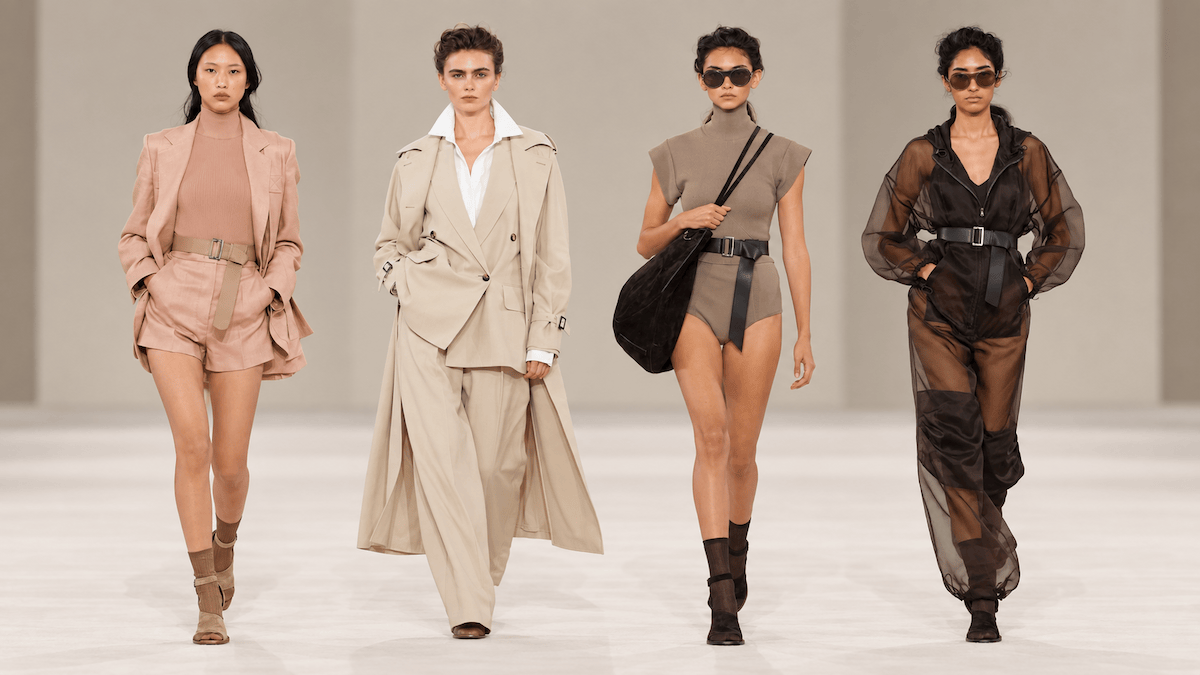
This morning at 9:30, Max Mara presented its Spring Summer 2027 collection in Milan, titled “Far Horizon”. A collection that does not try to rewrite the language of the brand, but to shift its point of view. The work starts once again from what Max Mara knows well and does best: construction, proportions, tailoring, control of form and fit. Here, however, the language becomes lighter, volumes open up and structure enters a more summery dimension without losing precision.

Ian Griffiths, creative director of the house, keeps working on a very strong stylistic signature without turning it into a constant quotation of the archive. It is an important step, especially in a season when many brands are changing direction, creative directors and references. Max Mara does not start from scratch: it works on its own structure and carries it forward.

The collection comes alive through the garments: long trench coats, blazers, wide high-waisted trousers, tailored shorts, white shirts, slip dresses, tops and vests build a very precise wardrobe. The belt returns often and becomes part of the construction: it cinches the waist, breaks up the volumes and defines the proportions. The palette moves between camel, tobacco, sand, taupe, beige, brown, black, white and powder pink, with sharper contrasts entrusted mainly to dark belts, tall boots and essential accessories.

The relationship between structure and lightness is particularly interesting. Tailored fabrics and more compact surfaces are paired with light, sheer, almost weightless materials. Some trench coats keep every element of the classic garment but are emptied of their weight; elsewhere, glossy surfaces, fine knits and more technical constructions appear. Even when the body is revealed through shorts, bodysuits, deep necklines or more fitted dresses, the construction remains controlled.

The looks work very well because they do not feel like runway exercises. These are clothes designed to be worn, with precise proportions and a fit that remains one of the house’s great strengths. “Far Horizon” thus works as a synthesis of the whole: the horizon shifts as you move, but it never disappears. Max Mara does the same: it changes its point of view, lightens, opens up, alters proportions, yet stays within a very clear line.

Spring Summer 2027 thus confirms a precise strategy: moving forward without losing its own measure.


GALLERY


Discover more of Sara’s World

Sara Dal Monte

Sara Dal Monte
Digital Journalist | Photographer | Art Director
Los Angeles • Sure-Com America
Instagram
X
Facebook
Facebook 2
Facebook Page

GENNY, SPRING SUMMER 2027 BETWEEN FLOWERS, SHEER FABRICS AND NEW PROPORTIONS

This morning at 10:30, Genny presented its Spring Summer 2027 collection in Milan under the creative direction of Sara Cavazza Facchini. A collection of 43 looks built on femininity, lightness and decoration, with a very evident work on volumes, sheer fabrics, embroidery and movement.

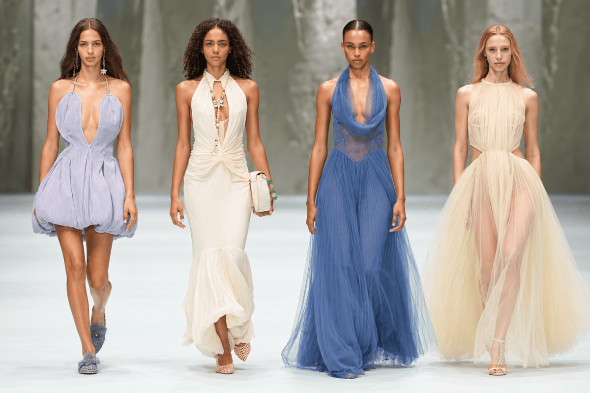
It is almost a garden that has stepped into the wardrobe. Flowers – printed, embroidered and appliquéd – run across dresses, trousers and denim; they appear on hems, on surfaces and as three-dimensional elements, together with lace, fringes, weaves and light fabrics. The palette moves from white and ivory to pink, lilac, light blue, yellow, olive green and brighter tones, while the silhouettes alternate balloon minidresses, long draped gowns, fluid trousers, light suits and deep necklines.

Cavazza Facchini works a great deal on the contrast between construction and softness. Some garments have almost sculptural shapes, others follow the body with greater fluidity; denim is treated as a decorative surface, while sheer fabrics and layering make even the most complex looks feel lighter.

Looking at the whole, a precise choice also emerges: this does not seem to be a collection designed mainly for everyday office life. Its center of gravity is closer to a resort and eventwear wardrobe – occasions, travel, evenings, ceremonies and moments when a dress needs to have presence. Sheer fabrics, necklines, embroidery, lace and important volumes all point in this direction, and it is hard to think it is accidental: it looks rather like a very conscious stylistic choice.

Genny thus builds a declared femininity, romantic but not fragile, decorative but not heavy. A collection designed to be seen, remembered and above all worn in those moments when the dress has to become part of the scene.


GALLERY


Discover more of Sara’s World

Sara Dal Monte

Sara Dal Monte
Digital Journalist | Photographer | Art Director
Los Angeles • Sure-Com America
Instagram
X
Facebook
Facebook 2
Facebook Page

JIL SANDER, WHEN MINIMALISM STOPS BEING RIGOR AND BECOMES MOVEMENT

This morning Jil Sander presented in Milan its Spring/Summer 2027 collection, women’s and men’s, designed by Simone Bellotti. The show was scheduled at 10:30 on the second day of Milan Fashion Week.

I chose these looks because, looking at them, the direction Bellotti is giving the house seems clear to me. Jil Sander’s minimalism remains, but it is no longer just subtraction. It gains volume, movement, a few deliberate imperfections. It is a purity that does not give up the ability to surprise.

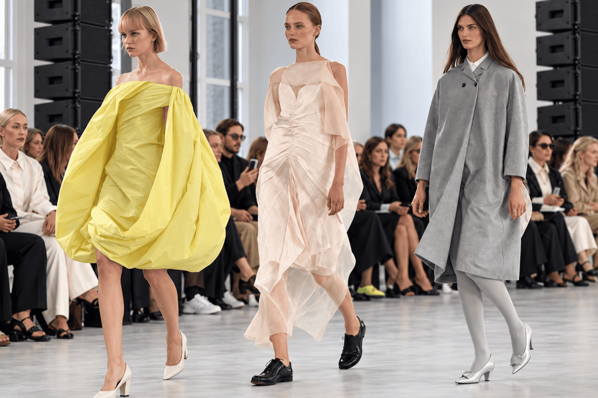
The grey coat perhaps expresses this idea better than any other piece. A wide, almost severe line, an essential construction, very few visible elements. And yet you only need to look at the proportions, the way it falls on the body and the pairing with very pale tights and almost old-fashioned feminine shoes to understand that behind that simplicity there is precise work. In the men’s look the same principle becomes darker and more vertical: an overcoat and wide trousers build a lean, contemporary figure, with no need to add anything else.

Then the yellow arrives and completely changes the register. A dress that seems built directly through the fabric: large amounts of material wrap the body, fall from the shoulders, gather at the front and open up again. It is not the color doing all the work. It is the volume. And precisely within a house identified for decades with minimalism, this controlled abundance becomes even more interesting.

I was also struck by the very pale, almost impalpable dress. Here Bellotti works in exactly the opposite way: sheer fabrics, gathers, layering and a construction that follows the body without imprisoning it. The black men’s shoes beneath such a light dress deliberately break any romantic temptation. It is one of those details that make you understand the collection is not looking for an easy kind of beauty.

And then there is that almost unexpected encounter between the bright, textured top, crossed by green, red and metallic reflections, and the skirt built like a landscape. It is probably the look furthest from the conventional image many people still have of Jil Sander. That is precisely why it works: it shows that a strong identity can afford to step outside its own boundaries without losing recognizability.

Finally, the light blue shirt with the white miniskirt. Seemingly nothing could be simpler. But it is the proportions that transform it: the men’s shirt, the clean-cut skirt, the grey tights and that white shoe with a small heel and a bow. Almost a uniform, but completely rewritten.

When he joined Jil Sander, Bellotti had already spoken of seeking a balance between structure, tailoring and classicism on one side, and modernity and lightness on the other. It is a path that began with his debut for the house in 2025 and that today appears freer.

This is what I find interesting about today’s Jil Sander: it does not destroy minimalism, it sets it in motion. The rigor remains, but it is no longer a cage. The body enters the project, the fabric breathes, color breaks the silence. And when a brand manages to change without losing its own grammar, then change truly begins to make sense.

GALLERY


Discover more of Sara’s World

Sara Dal Monte

Sara Dal Monte
Digital Journalist | Photographer | Art Director
Los Angeles • Sure-Com America
Instagram
X
Facebook
Facebook 2
Facebook Page

VOGUE WORLD MILAN 2026: TONIGHT I SAW AN IMAGE I HAD IMAGINED COME TO LIFE

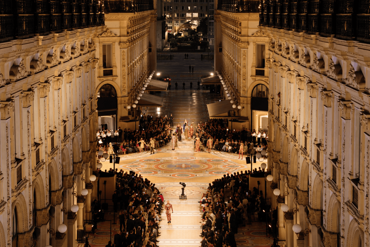
On September 4, while writing about Milan Fashion Week, I imagined a major fashion show taking place inside the Galleria Vittorio Emanuele II. I did so for a very simple reason: I believe it is one of Milan’s most powerful images, perhaps one of the locations that best embodies Italian fashion. The Galleria has beauty, history, architecture and a natural sense of theatre. It is Milan in one of its most recognizable forms.

That is why I created exactly that scene for the cover of the article. Tonight, watching Vogue World transform the Galleria into a spectacular stage for fashion, I immediately thought back to what I had written on September 4.

Of course, Vogue World had been conceived, planned and organized long before then. There is no connection between the two things. But seeing that same vision of Milan I had imagined a few weeks ago come to life — on an entirely different scale and at another level — was quite something.

And after seeing the Galleria tonight, I am even more convinced of one thing: this is one of the places in Milan where fashion should take to the runway.

Then the show began, and what moved me most was not simply seeing top models, actresses, actors, singers, dancers and athletes walk through one of Milan’s most beautiful landmarks. It was seeing alongside them the artisans, workers and people who represent that long and complex supply chain without which fashion simply could not exist. Behind every garment there are hands, skills, fabrics, workshops, pattern makers, seamstresses, technicians and companies.

There is an enormous world that normally remains behind the scenes, working every day so that this industry can continue to create beauty, culture, employment and value. Vogue World Milan had the merit of bringing that world into the spotlight as well, telling the story of Made in Italy through the relationship between human craftsmanship, industry, creativity and innovation.

Fashion is often described as superficial, even frivolous. Part of it certainly can be, but stopping there means failing to understand its language. The way we dress is also a way of communicating something about ourselves, of showing others how we choose to present ourselves and, sometimes, simply of making ourselves feel better. Clothes do not define who we are, but they can contribute to the way we choose to express it.

And then there is beauty — perhaps the word that has stayed with me more than any other tonight: the Galleria Vittorio Emanuele, the music, the dance, the models, the artists and, above all, the human work that makes all of this possible.

Yet perhaps never more than now should we remind ourselves just how precious and fragile all of this is. We are living through days in which words we thought belonged to history books have returned: war, borders, missiles, rearmament. Images reach us every day from every corner of the world, and we even risk becoming accustomed to them. Then, for one evening, beneath the glass vaults of Milan’s Galleria, something completely different passes before our eyes: people who have built, sewn, designed, sung, danced and performed.

People who have devoted time, intelligence and talent to creating something beautiful. It has taken generations to build culture, craftsmanship, knowledge, cities like Milan and industries such as Italian fashion.

Losing all of it, however, could take far less.

Perhaps that is also why the Galleria looked even more beautiful to me tonight.


Discover more of Sara’s World

Sara Dal Monte

Sara Dal Monte
Digital Journalist | Photographer | Art Director
Los Angeles • Sure-Com America
Instagram
X
Facebook
Facebook 2
Facebook Page